Top Color Trends for 2025 (and How to Use Them at Home)
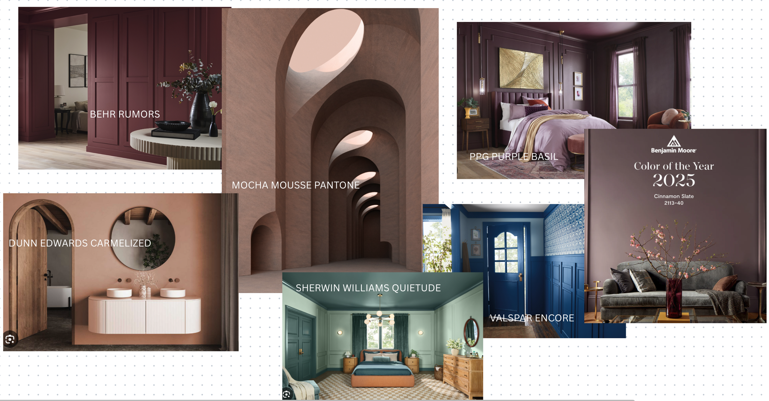
If 2024 was about “quiet luxury,” 2025 leans into grounded richness—colors that feel warm, artful, and reassuring, yet still modern. Major color authorities have already set the tone: Pantone named Mocha Mousse (17-1230) its Color of the Year; Benjamin Moore chose Cinnamon Slate (2113-40), a heathered plum-brown; BEHR went bold with Rumors, a ruby red; PPG crowned Purple Basil (PPG1046-7); Valspar introduced Encore, a confident navy; and Dunn-Edwards selected Caramelized (DET687), a terracotta-brown “new neutral.” Together, they paint a clear picture: chocolatey browns, nuanced plums, confident blues, and strategic reds are center stage. (Pantone, Benjamin Moore, The Home Depot, PPG Paints, valspar.ca, Dunn-Edwards Paints)
Fashion often hints at what will feel fresh at home next. On the runways for Fall/Winter 2025, editors spotlighted powder pinks, mocha browns, vibrant reds, deep blues, greens (from “slime” to forest), and electric aubergine—a moody purple. Translate that to interiors and you get a palette that balances comfort with a little drama—perfect for spaces that should feel collected, not cluttered. (Vogue, Marie Claire)
Below, I’ll break down the top color families of 2025 and exactly how to apply them in real homes—what to paint, what to upholster, where to add just a touch, and how to keep everything cohesive.
1) The Return of True Browns & Terracotta Neutrals
Why it’s trending: Pantone’s Mocha Mousse anchors the shift to brown as a modern neutral—deep, cocoa tones that read calm, elegant, and surprisingly versatile. Dunn-Edwards’ Caramelized underscores the terracotta side of the story, a sun-baked, earthy brown that pairs beautifully with black, cream, and warm metals. (Pantone, Dunn-Edwards Paints)
How to use at home
- Walls: Try brown in rooms where you want warmth and conversation—living rooms and dens. It’s beautiful on a single enveloping space (walls + ceiling) with lighter trim for contrast.
- Textiles: Lean on wool bouclé, velvet, and nubby linen in tobacco, toffee, and clay. These textures add depth so brown feels layered, not flat.
- Pairings: Crisp cream, travertine, unlacquered brass, smoked wood, and black accents keep brown feeling intentional and tailored.
- Lighting check: Browns absorb light; add table lamps, picture lights, and warm-white bulbs (2700–3000K) so the room glows at night.
Good to know: If you’re paint-shy, leather (sofa, sling chair, or ottoman) gives you the richness of brown without repainting.
2) Sophisticated Plums & Dusty Violets
Why it’s trending: Benjamin Moore’s Cinnamon Slate (2113-40) and PPG’s Purple Basil meet in the elegant middle ground between purple and brown—mature, cozy, and quietly glamorous. Fashion’s “electric aubergine” echoes the same mood with more intensity. (Benjamin Moore, PPG Paints, Vogue)
How to use at home
- Bedrooms & libraries: A plum accent wall or full room can read like a velvet curtain—grounding and serene.
- Powder rooms: High-impact in small doses; finish with brass or aged bronze and creamy white stone.
- Upholstery: A single plum velvet chair or ottoman brings sophistication without committing a whole room.
- Pairings: Walnut, caramel leather, bone, soft blush, and smoky glass keep it chic.
Designer tip: If your home skews modern coastal or Northern California light, choose the dustier end of purple (less saturation) to avoid a jarring contrast with sunlit spaces.
3) The Red Revival—Used Intentionally
Why it’s trending: BEHR’s Rumors put ruby back on the map; Glidden’s spray paint “Brick Red” supports the red-moment for small accents. Runways leaned into chili-pepper reds for energy—there’s a similar appetite at home, but in right-sized doses. (The Home Depot, SpecialChem)
How to use at home
- Front doors & entry moments: A red door is a timeless statement—especially striking with limestone, cream stucco, or charcoal siding.
- Dining rooms: Red can feel festive and flattering at night; keep trims neutral and use dimmable lighting.
- Micro-accents: Picture frames, lamp bases, or a single patterned pillow with a red thread—perfect for the “color curious.”
Balance move: Ground red with brown (mocha, saddle) rather than stark white. It feels richer and less holiday-coded.
4) Deep, Confident Blues
Why it’s trending: Valspar’s 2025 pick Encore signals a return to saturated navy with a violet undertone—classic, but bolder than the grays of the last decade. Runway coverage also called out icy to cobalt blues as a key 2025 story. (valspar.ca, Paper Heart Design Co., Facebook, Vogue)
How to use at home
- Cabinetry & built-ins: Navy millwork in offices, dining buffets, or media walls feels polished and hides wear.
- Bedrooms & baths: Blue calms—great for primary suites and powder rooms with marble or limestone.
- Textiles: Indigo linen curtains, a midnight wool rug, or a chambray duvet instantly cools a warm palette.
Pairings: Brass, honed marble, rift-sawn white oak, and camel leather keep navy feeling modern rather than nautical.
5) Grounded Greens & Soft Teals
Why it’s trending: Sherwin-Williams’ 2025 Colormix Capsules forecast balances soothing greens with warm neutrals; HGTV Home by Sherwin-Williams’ 2025 Collection (Quietude, Delft, Rocky River, more) shows how livable these greens can be. On the runways, greens—from matcha to lettuce—continue to surface as fresh counterpoints to browns. (Sherwin-Williams, HGTV Home by Sherwin-Williams)
How to use at home
- Bedrooms: Quiet, grayed-off greens (think eucalyptus) read restorative and pair well with muted mauves and oatmeal linen.
- Kitchens: Soft teal islands or pantry doors play beautifully with travertine, clay tile, and natural oak.
- Sunrooms: Sage and moss connect indoor plants and outdoor views, expanding a small space visually.
Keep it cohesive: Repeat green three times—a wall color, a patterned pillow, and leafy stems—so it feels intentional, not random.
Quick Pairing Guide (2025 Edition)
- Mocha Brown + Powder Pink + Brass: Warm and feminine without tilting sweet; ideal for living rooms or dressing rooms. (Powder pink was spotlighted on F/W 2025 runways.) (Vogue)
- Plum (Cinnamon Slate) + Camel + Bone: Cozy library palette that works with both modern and traditional furniture. (Benjamin Moore)
- Navy (Encore) + Terracotta (Caramelized) + Cream: A confident, gallery-ready combo for dining or entry. (valspar.ca, Dunn-Edwards Paints)
- Ruby Red (Rumors) + Mocha + Black: Date-night dining room or a dramatic entry bench moment. (The Home Depot)
- Eucalyptus Green + Travertine + Blackened Bronze: Spa-calm bathroom direction anchored by natural stone. (HGTV Home by Sherwin-Williams)
Room-by-Room: Exactly Where to Put the Color
Living Room
- Walls: Mocha or terracotta for an intimate, collected feel; balance with cream upholstery and a navy accent chair.
- Rug: Ground with wool or jute; let art introduce plum or red in small hits.
- Lighting: Picture lights and shaded lamps to add warmth back to deeper walls.
Dining Room
- Walls or Ceiling: Go bold—plum or navy—then soften with linen drapery and unlacquered brass.
- Art & Objects: A ruby-red vase, a terracotta bowl, or a cinnabar lacquer tray—micro-doses of red that elevate the scheme.
Bedroom
- Walls: Dusty violet or eucalyptus green for a restorative feel.
- Textiles: Mix matte (percale, wool) with a single luxe element (silk-bordered blanket or velvet lumbar) so it feels rich, not fussy.
Kitchen
- Cabinetry: Navy on an island or lower banks; keep uppers light.
- Backsplash: Zellige or tumbled limestone in cream/greige supports the 2025 warmth narrative.
Powder Room
- All-over color box: Plum, navy, or even mocha—small spaces can handle saturation. Add unlacquered brass hardware and a marble splash for glow.
Exterior
- Front Door: Red is classic and on-trend; pair with a warm white façade and natural stone for balance. (The Home Depot)
Neuroaesthetics: Match Color to the Mood You Want
- Calm & Confidence: Browns and mossy greens reduce visual “glare,” signaling safety and stability—great for rooms where you start or end the day.
- Focus: Navy and muted plums help edges read crisply; ideal for offices and libraries.
- Energy & Connection: Red is social; use it in dining or entry (micro-doses are sufficient).
If you’re easily overwhelmed by options, decide the feeling first (calm, cozy, vibrant), then let that mood narrow your palette to two main hues + one accent.
Test Like a Pro (So You Love It on the Wall)
- Sample in the largest size you can. Paint poster boards (2–3 coats) and move them around the room.
- Check at three times of day. Morning, late afternoon, and nighttime (lamps on). Browns and plums, especially, shift with light.
- Confirm with materials. View samples next to your wood tones, stone, fabrics, and art—colors must love the company they keep.
- Lock in sheen. For walls, eggshell is forgiving; for millwork, satin/semigloss wears well and shows color depth.
What to Do If Your Home Already Skews “Gray”
You don’t have to repaint everything at once. Transition with brown-leaning accents (pillows, throws, a leather ottoman), swap cool metallics for brass/bronze, and add natural stone (travertine, soapstone). Once the new palette feels at home, choose a single high-impact area (entry, dining, powder) for your first paint project.
3 Easy Color Plans for 2025
The Warm Modernist
- Walls: Mocha Mousse-inspired brown
- Anchor: Cream sofa, oak wood, travertine
- Accent: Plum velvet pillows + small ruby object (bowl, book stack)
Result: Quietly luxurious, gallery-ready living space. (Pantone)
The Calm Curator
- Walls: Eucalyptus/Quietude-style green
- Anchor: Linen drapery, woven textures, matte black fixtures
- Accent: Navy ceramic lamp or art frame
Result: Spa-adjacent serenity with visual interest. (HGTV Home by Sherwin-Williams)
The Statement Traditionalist
- Walls: Navy (Encore-adjacent) dining room or built-ins
- Anchor: Cream rug, antique wood table, brass chandelier
- Accent: Single red floral arrangement or lacquer tray
Result: Classic bones with a 2025 spark. (valspar.ca)
The Big Picture
2025 is not about a single “it” color—it’s about layered warmth and confidence. Browns replace grays as the grounding neutral. Plums and violets bring subtle luxury. Navy returns as a refined backbone. Red reappears as a small-but-mighty statement. Greens keep us tethered to nature. Mix two of these families and repeat them in paint, textiles, and one sculptural element (a lamp, a chair, an art frame), and your home will feel current without feeling trendy.
Are you ready to make a change in your space/home? Call Creative Space Interiors today for the Refresh you’ve imagined at 510.501.1213.


